


Project Info
| Client: | Massachusetts Department of Public Health (MaDPH) |
| Project: | Show Me for Emergencies: mobile app refresh |
| Role: | Lead User Interface (UI) Designer: refreshed all parts of the user interface in collaboration with a UX designer who designed flows and wireframes |
| Skills: | App design, UI design |
| Software: | Illustrator, Figma |
| Designed Materials: | User interface designs for refreshed app |
| Awards: | 2025 Clearmark Award for Best App |
Opportunity
The Show Me for Emergencies app is a free, research-based tool that helps emergency responders and shelter staff communicate with people who have limited English proficiency, disabilities, or communication barriers. In emergencies, being misunderstood can be dangerous. The existing app was visually outdated, cluttered, and difficult to navigate, with lower contrast that made it harder to use in high-stress, chaotic situations. The app needed a comprehensive UI refresh that prioritized usability, accessibility, and inclusivity for diverse users, with special attention to people with developmental disabilities who would be using it when every second counts.

Approach

Streamlined Navigation & Information Architecture
Collaborated with the UX designer to simplify the app structure, combining two separate apps into one unified tool. Applied a “less is more” approach to help users find what they need quickly in emergency situations, reducing cognitive load through clear visual hierarchy and consistent layouts.
Designed for Cognitive Accessibility
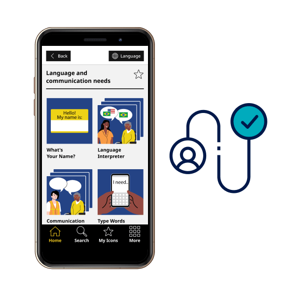
Made UI decisions specifically for users with developmental disabilities: larger tap targets, icons paired with text labels, limited options per screen, and simplified navigation patterns. Every design choice considered how people process information under stress and in crisis.


High-Contrast, Minimalist Interface
Developed a clean, high-contrast visual system that kept content as the focus. Worked within MaDPH brand guidelines while treating the app as a distinct sub-brand, ensuring the UI remained clear and legible in chaotic emergency scenarios.
Art Directed Accessible Illustrations
Advocated for and directed a holistic refresh of nearly 300 multilingual icons, championing DEI and accessibility best practices: diverse skin tones, concrete and realistic concepts for users with developmental disabilities, and strong color contrast for users with visual impairments. Collaborated with an illustrator to execute the vision.

Validated Through User Testing
Worked within tight budget constraints, making strategic decisions about where to invest limited resources. Designs were validated through multilingual usability testing with diverse audiences to ensure the refresh met real-world communication needs.
Impact

Reflection
This project taught me how to design for people in their most vulnerable moments. Working under tight budget constraints meant making strategic decisions about where every design choice would have the most impact. The cognitive accessibility work was particularly meaningful, requiring me to think beyond aesthetics to how people with developmental disabilities process information under extreme stress. Advocating for the illustration refresh and collaborating with the UX designer and illustrator showed me the power of cross-functional partnership in creating truly accessible tools. This wasn’t about making something beautiful—it was about designing something that could help save lives.